百度智能小程序 自定义导航
navigation 顶部导航 bar
解释: 顶部自定义的导航栏,其中不包含界面,仅仅是限制了开发者写顶部 bar 内容的区域,使之在安全区内完成顶部内容的渲染;支持配置返回首页、上一页按钮,和滑动切换效果主题。
设计文档详见 顶部导航栏 。
属性说明
| 属性名 | 类型 | 必填 | 默认值 |
说明
|
|---|---|---|---|---|
| backgroundColor | string | 否 | #fff | 导航背景色 |
| frontColor | string | 否 | #000 | 前景颜色(目前特指字体颜色) |
| opacity | Number | 否 | 1 | 导航背景透明度 |
| navigationStyle | Object | 否 | {} | 导航容器自定义样式(加在行间样式上) |
| navigationAreaStyle | Object | 否 | {} | 导航内容可视区自定义样式(加在行间样式上) |
| type | String | 否 | default | 自定义导航类型:default 为默认,switchNav 为切换导航栏模式 |
| backIcon | Boolean | 否 | false | 是否显示返回图标 |
| homeIcon | Boolean | 否 | false | 是否显示首页图标 |
| backIconSize | String | 否 | 35.02rpx | 返回图标大小 |
| homeIconSize | String | 否 | 35.02rpx | 显示首页图标大小 |
| switchStartPosition | Number | 否 | statusBarHeight
(计算得来的 默认状态栏的高度) |
切换模式下,导航栏起始位置,默认状态栏的高度 |
| switchEndPosition | Number | 否 | 100 | 切换模式下,是否隐藏顶部 |
| commonBar | Object | 否 | {'opacity':1,
'title':'', 'frontColor':'#000', 'bgColor':'#fff', 'backIcon':true, 'homeIcon':false, 'navigationStyle':{}, 'navigationAreaStyle':{}} |
切换模式下,初始的导航样式 |
| fixedBar | Object | 否 | {'opacity':1,
'title':'fixed', 'frontColor':'#000', 'bgColor':'pink', 'backIcon':true, 'homeIcon':false, 'navigationStyle':{}, 'navigationAreaStyle':{}} |
切换模式下,滚动后的导航样式 |
| isFullScreenWidth | Boolean | 否 | false | 宽度是否撑满屏幕 |
示例

代码示例
<view class="wrap">
    <image class="iphone-image-area"
        mode="widthFix"
        src="{{showSwicthNav ? iphoneGifSrc : iphoneImgSrc}}"
    />
    <image class="status-image-area {{showSwicthNav ? 'hide' : ''}}"
        mode="widthFix"
        src="{{statusImgSrc}}"
    />
    <smt-navigation
        navigation-style="{{navigationStyle}}"
        navigation-area-style="{{navigationAreaStyle}}"
        back-icon="{{backIcon}}"
        home-icon="{{homeIcon}}"
        front-color="#fff"
        bindbackHdl="backHdl"
        bindhomeHdl="homeHdl"
        backgroundColor="transparent">
        <view class="navigation-content-area {{showTitle ? '' : 'hide'}}">
            <text class="navigation-title">{{title}}</text>
            <text class="navigation-desc">{{desc}}</text>
        </view>
    </smt-navigation>
    <view class="btns-area">
        <button s-for="item,index in btnsList"
            type="primary"
            data-type="{{item.type}}"
            data-index="{{index}}"
            disabled="{{item.disabled}}"
            hover-stop-propagation="true"
            bind:tap="tapHdl">
            {{item.text}}
        </button>
    </view>
</view>
Page({
data: {
homeIcon: false,
backIcon: false,
btnsList: [{
type: 'back',
text: '显示"返回上一页"按钮'
}, {
type: 'home',
text: '显示"返回首页"按钮'
}, {
type: 'both',
text: '显示"返回上一页&返回首页"按钮'
}, {
type: 'switch',
text: '点击演示上滑页面导航变色'
}, {
type: 'reset',
text: '重置'
}],
iphoneImgSrc: 'https://b.bdstatic.com/miniapp/images/simulator.png',
iphoneGifSrc: 'https://b.bdstatic.com/miniapp/images/simulator.gif',
statusImgSrc: 'https://b.bdstatic.com/miniapp/images/smt_status.png',
navigationStyle: {
'position': 'relative',
'margin-top': '-836rpx',
'padding': '0 0 0 30.19rpx',
'height': '30px',
'width': '100%'
},
navigationAreaStyle: {
height: '45px'
}
},
/**
* 点击返回上一级按钮
*
*/
backHdl() {
this.changeNavHdl('上一页面');
},
/**
* 点击返回首页按钮
*
*/
homeHdl() {
this.changeNavHdl('小程序首页');
},
/**
* 切换模拟器公共方法
*
* @param {string} title 标题
* @param {string} desc 描述
* @param {boolean} backIcon 是否配置返回按钮
* @param {boolean} homeIcon 是否配置返回首页按钮
*/
changeNavHdl(title) {
this.setData({
title,
desc: 'detail',
backIcon: false,
homeIcon: false
});
setTimeout(() => {
this.setData({
showTitle: true
});
}, 300);
},
/**
* 点击按钮触发
*
* @param {Event} e 事件对象
* @param {Object} e.currentTarget.dataset 该按钮的数据对象
*/
tapHdl(e) {
const {type, index} = e.currentTarget.dataset;
const homeIcon = /home|both/.test(type);
const backIcon = /back|both/.test(type);
this.setData({
title: '',
desc: '',
homeIcon,
backIcon,
showTitle: false,
showSwicthNav: type === 'switch',
btnsList: this.data.btnsList.filter((btnVal, btnIndex) => {
if (type === 'reset') {
btnVal.disabled = false;
}
else if (btnIndex === index) {
btnVal.disabled = true;
}
return btnVal;
})
});
}
});.wrap {
height: 100%;
padding: 0;
background: #f5f5f5;
}
.hide {
opacity: 0;
}
.header-content-custom {
display: flex;
width: 100%;
height: 100%;
align-items: center;
justify-content: space-between;
}
.header-content-area {
height: 100%;
flex: 1;
box-sizing: border-box;
}
.wrap .smt-card-area {
margin: 25.362rpx 0 72.464rpx;
background: #fff;
}
.wrap .area-content {
height: 635.87rpx;
}
.header-content-subtitle {
z-index: 99;
display: block;
font-size: 23.55rpx;
color: #999;
}
.wrap .item-logo {
display: inline-block;
width: 32.609rpx;
height: 32.609rpx;
margin: 34.005rpx 0;
}
.page-status-hover {
opacity: .2;
}
.iphone-image-area {
width: 702.9rpx;
height: 580.92rpx;
margin: 22.34rpx 23.55rpx;
}
.status-image-area {
width: 661.84rpx;
position: relative;
top: -766rpx;
left: 44rpx;
}
.btns-area {
position: fixed;
width: 100%;
bottom: 18.12rpx;
background: #f5f5f5;;
padding-top: 12.08rpx;
}
.navigation-content-area {
width: 100%;
margin-left: 20%;
}
.navigation-desc {
font-size: 23.55rpx;
}
.navigation-title,
.navigation-desc {
display: flex;
justify-content: center;
align-items: center;
transition: opacity .5;
}
.navigation-desc {
opacity: .6;
}
button {
margin: 36.23rpx 41.67rpx;
font-size: 32.61rpx;
line-height: 79.71rpx;
}{
"navigationBarTitleText": "icon",
"navigationStyle": "custom",
"backgroundColorTop": "#f5f5f5",
"backgroundColor": "#f5f5f5",
"usingComponents": {
"smt-navigation": "@smt-ui/component/src/navigation",
"smt-icon": "@smt-ui/component/src/icon"
}
}左侧自定义区域可呈现选择城市、搜索框等功能。注意左侧自定义区域内容应与右侧的胶囊水平对齐。技术实现请参考开发文档详见 全局配置 。
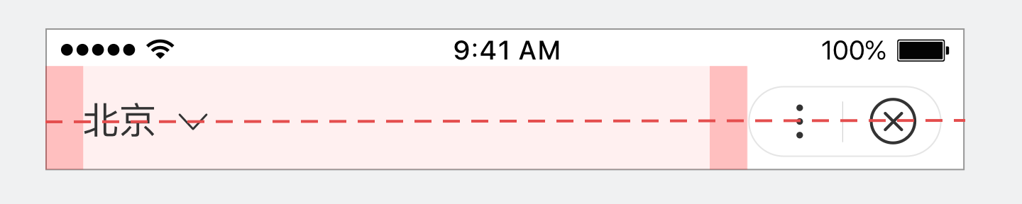
正确
左侧城市选择功能与右侧胶囊水平对齐。
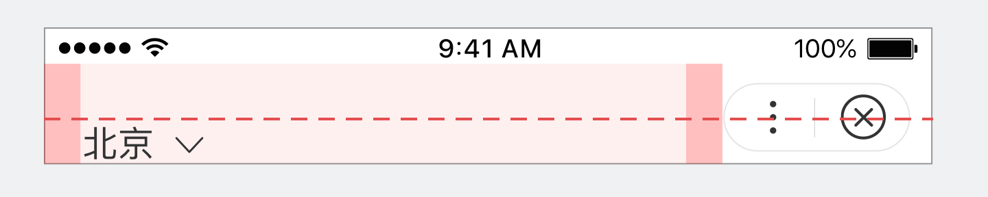
错误
左侧城市选择功能与右侧胶囊未水平对齐。
直接访问小程序某页面(非首页)时,顶部导航栏应提供回首页(homeIcon)功能便于用户操作,注意此时因未发生跳转无需提供返回功能。
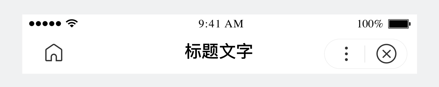
正确
直接访问小程序某页面提供回首页功能。
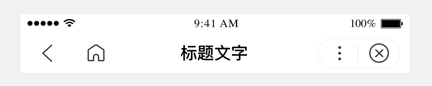
错误
直接访问小程序某页面未提供回首页功能。
访问某页面(非首页)后在小程序内发生跳转,自定义功能区应提供返回(backIcon)和回首页(homeIcon)功能,从左至右依次展现。
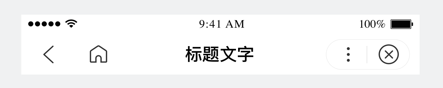
正确
正确有序的展现返回和回首页功能。
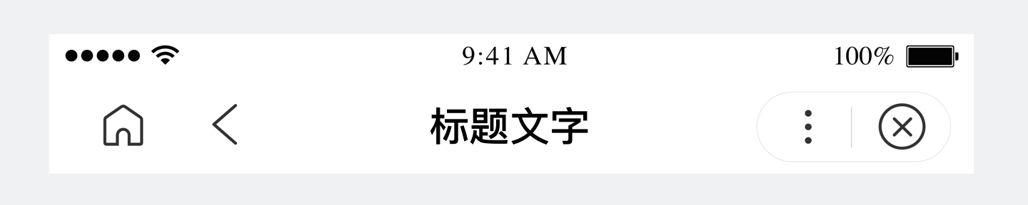
错误
返回和回首页功能展现顺序有误。
自定义配置容器背景(backgroundColor)颜色时,请重点关注信息的可识别性和整体阅读舒适度。状态栏颜色与顶部导航栏颜色一致。
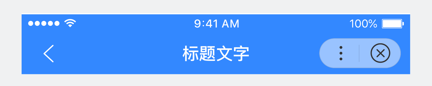
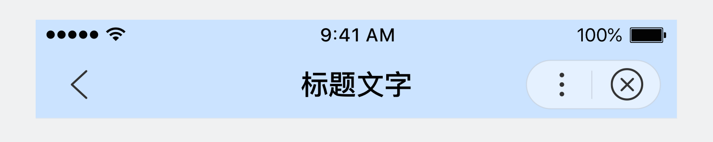
正确
导航栏背景与元素搭配舒适、内容易读性佳。
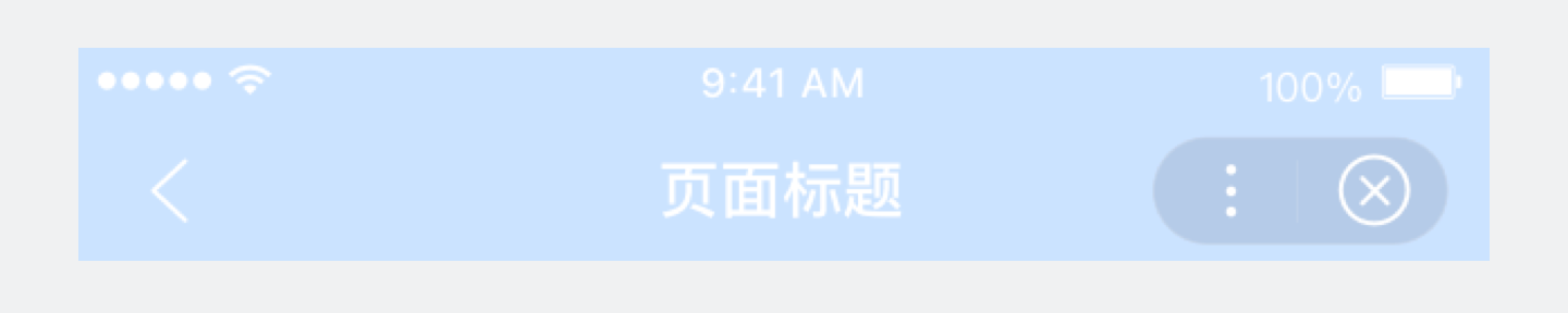
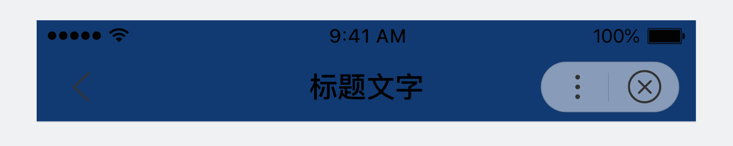
错误
导航栏背景与元素搭配不舒适、内容易读性差。
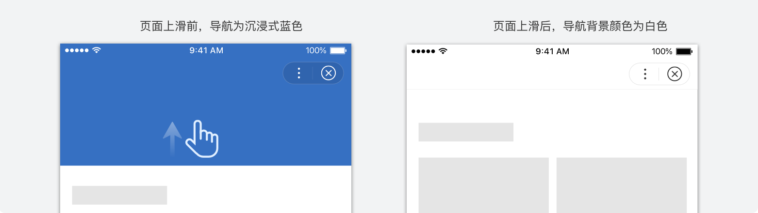
顶部导航栏支持上滑变色浏览体验更为沉浸,请注意切换后导航背景颜色配置应注意与页面内容背景颜色一致。